Canva Font Pairings: How to Choose Fonts That Work Together (Easy)
Choosing fonts sounds like it should take five minutes.
Then somehow you’re 45 minutes deep into Canva, clicking through font after font, wondering whether any of them actually look good together.
If you’ve ever gotten stuck trying to choose Canva font pairings, the problem probably isn’t that you need more options. Canva already has plenty.
The problem is narrowing them down.
A good font pairing needs enough contrast to make the design interesting, but enough consistency that everything still looks intentional. And when you’re making a workbook, printable, social graphic, digital product, or brand graphic, font selection really shouldn’t become the entire project.
Here’s a simpler way to do it.
Start With the Job Each Font Needs to Do
Before you start scrolling through Canva fonts, decide what you actually need.
For most designs, two fonts are enough.
Headline font
This is where you can use more personality.
Depending on the project, your headline font might be:
- Elegant
- Bold
- Playful
- Mystical
- Vintage
- Handwritten
- Modern
- Decorative
Its job is to get attention and help establish the overall style of the design.
Body font
Your body font has a different job: it needs to be easy to read.
It should support the headline rather than compete with it.
You may occasionally need a third font for a small accent, label, or quote, but adding more fonts usually makes the design harder to control.
Look for Contrast, Not Matching
Your fonts don’t need to look alike.
In fact, fonts that are too similar can make a design look accidental.
Instead, look for contrast.
Some combinations that tend to work well:
- Serif headline + sans serif body
- Script headline + simple serif or sans serif body
- Bold sans serif headline + lighter sans serif body
- Decorative display font + very simple body font
The easiest question to ask is:
Can I immediately tell which font is supposed to get my attention first?
If both fonts are fighting for attention, the pairing probably needs work.
Let One Font Be the Interesting One
This is one of the easiest ways to make font pairing less complicated.
If your headline font has a lot of personality, keep your body font simple.
If your headline is clean and understated, you have a little more room to use something distinctive elsewhere.
Combinations like these are much harder to make work:
- Ornate + ornate
- Script + script
- Quirky + quirky
- Bold display font + another bold display font
You can use them intentionally, but for most business and digital-product designs, one strong personality font is enough.
5 Canva Font Pairing Ideas to Try
If you just want somewhere to start, here are a few combinations with different moods.
1. Playfair Display + Montserrat
Style: elegant, polished, editorial
Use Playfair Display for headlines and Montserrat for body copy.
This pairing works well for:
- Workbooks
- Branding
- Coaching resources
- Social graphics
- Elegant digital products
2. Cormorant Garamond + Open Sans
Style: refined, soft, slightly romantic
Cormorant Garamond gives you a more expressive serif, while Open Sans keeps longer text easy to read.
Try it for:
- Spiritual brands
- Journals
- Guides
- Invitations
- Wellness-related designs
3. DM Serif Display + Poppins
Style: modern with personality
DM Serif Display gives the headline some character while Poppins keeps everything else clean.
Good for:
- Digital products
- Lead magnets
- Pinterest graphics
- Websites
- Brand materials
4. Bebas Neue + Montserrat
Style: bold, modern, direct
This works when you need a headline that gets attention quickly.
Try it for:
- Sales graphics
- Posters
- Pinterest pins
- Product graphics
- Bold branding
5. Libre Baskerville + Lato
Style: classic, readable, professional
This pairing is especially useful when the design has a lot of text and readability matters more than decoration.
Try it for:
- Ebooks
- Educational materials
- Workbooks
- PDFs
- Business resources
These aren’t rules. Think of them as starting points.
The best pairing still depends on the project you’re making.
Check the Pairing With Your Actual Words
A font can look great in Canva’s font menu and terrible with your actual headline.
Before committing, test your real text.
Try:
- Your business name
- An actual product title
- A workbook heading
- A sentence of body text
- Numbers, if your design uses them
- Uppercase and lowercase text
This matters especially with scripts and decorative fonts. Some letter combinations look much better than others.
A font pairing is only useful if it works with the thing you’re actually making.
Check Readability at the Size People Will Actually See
Zooming in can hide a lot of problems.
If you’re creating a Pinterest pin, look at it small.
If you’re making a workbook, check the body copy at normal reading size.
If you’re designing a printable, think about how it will look when printed rather than filling your entire computer screen.
Pretty fonts stop being useful very quickly when people can’t read them.
Use Style as a Filter
Instead of asking:
Which two fonts should I use?
Start with:
What should this design feel like?
Maybe you want:
- Elegant
- Mystical
- Playful
- Earthy
- Romantic
- Professional
- Vintage
- Modern
- Cute
- Bold
Now you have a much smaller decision to make.
Choose a headline font that communicates that style, then pair it with something quieter and easy to read.
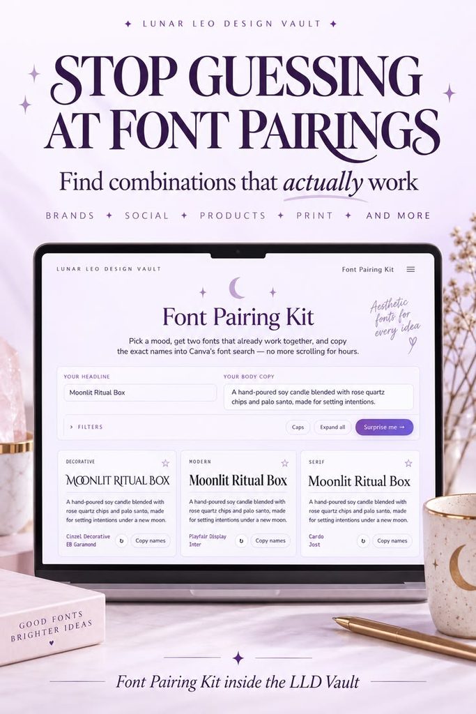
This is also one reason I built the Font Pairing Kit inside the Lunar Leo Design Vault.
Instead of clicking through Canva’s entire font library every time you make something, you can start with the style you want and browse font combinations that already work together.
A Simple Canva Font Pairing Workflow
When you’re choosing fonts for a design, use this:
1. Decide how the design should feel
Choose one or two words.
For example:
mystical + elegant
or
cute + playful
2. Choose your headline font
This is usually where most of the personality belongs.
3. Add a simple body font
Pick something readable that doesn’t compete with the headline.
4. Test your actual text
Don’t judge a font only by the preview inside Canva.
5. Check the hierarchy
Your headline, subheading, and body copy should clearly look like different levels of information.
6. Stop
If the fonts look good together, fit the project, and are easy to read, you’re done.
You do not need to audition another 37 fonts just because Canva has them.
Want to Skip Most of the Searching?
The Font Pairing Kit inside the Lunar Leo Design Vault gives you ready-to-use Canva font combinations organized by style.
You can use it to:
- Browse font pairings by visual style
- Preview combinations before committing
- Test your own text
- Copy the exact Canva font names
- Make font decisions faster
It’s one of 30+ creative-business tools inside the Vault, along with almost 400 commercial-use asset sets, including clip art, digital paper, stock images, templates, and more.
Stop Starting from Scratch Every Time
The Lunar Leo Design Vault is a growing creative-business toolkit designed to help you make, solve, plan, package, and finish your work faster.
Inside paid access, you’ll find:
- 30+ original tools for design, product creation, marketing, organization, and getting unstuck
- 15,000+ commercial-use files, including clip art, digital paper, and stock images
- A growing library of resources you can come back to whenever you need them
VIP members also get additional templates, mockups, courses, PLR resources, and more.
The goal is simple: give you useful tools and resources so you don’t have to rebuild the same parts of your business from scratch every time.
Full access is available with monthly or annual billing. Cancel or change plans anytime.